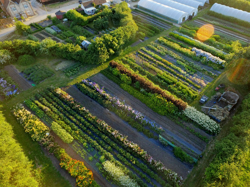
Green and Gorgeous celebrated it’s tenth anniversary this year. In 2008 I started growing on about 1/4 acre, squeezed in amongst rows of organic veg, the flowers proved their worth and slowly they crept across the entire site, with further tunnels being installed to protect the more delicate blooms and extend the season. Here we are today on four acres with our home and workshop overlooking the fields….
Over the past decade I have seen a huge rise in the number of people throwing in the day job to boldly go into the flower patch, from nurses to accountants, many with no horticultural or floristry experience – just a love of flowers and a need to do something they are interested in and inspired by for a living.
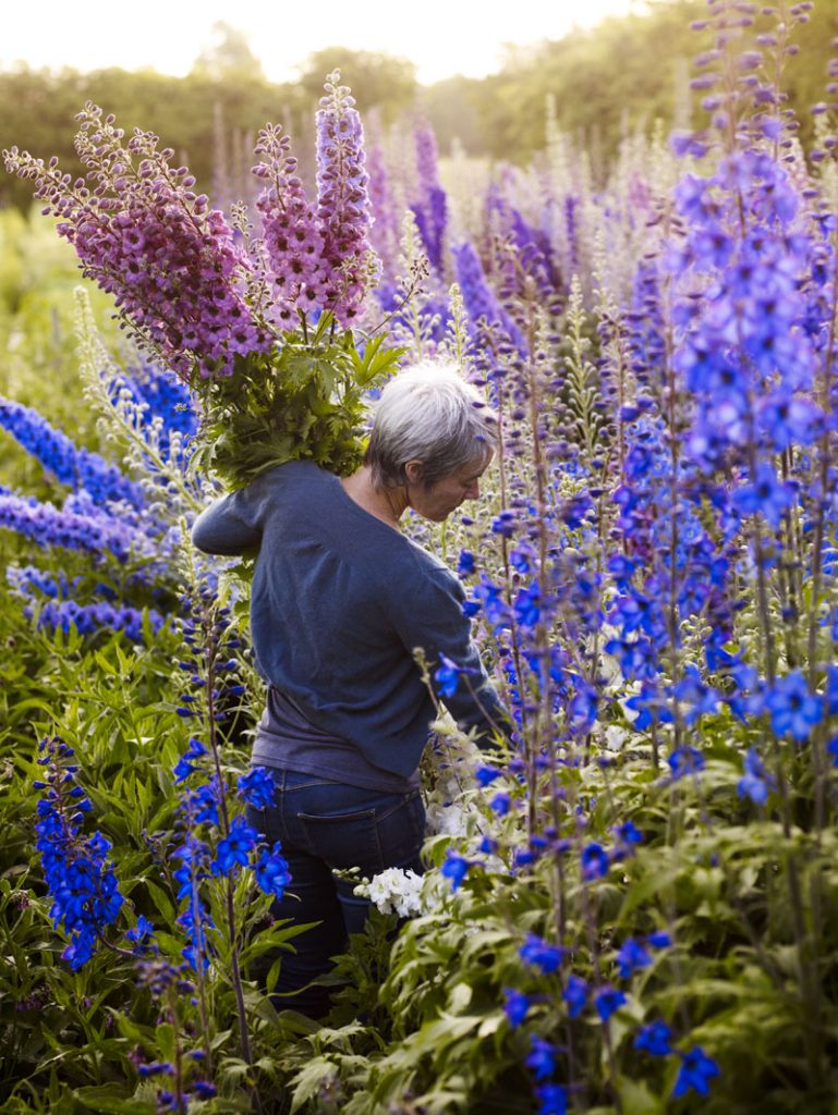
I decided to become a flower grower after being a gardener for many years and was still unprepared for how much and how quickly I needed to learn so that I did not end up wasting enormous amounts of time and money.
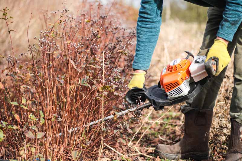
Even with good horticultural skills and plant knowledge I had to find ways of scaling up my gardening practises without completely exhausting myself.
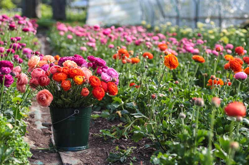
There was also the small matter of learning how to arrange flowers to make them irresistible to my customers, which in turn brought up many other questions. What were the right flowers to grow that would meet their tastes and requirements, how to ensure a continual supply against all the weather would throw at us and how can I organize all of this into the space and time that I have so I can still have a life outside of work?
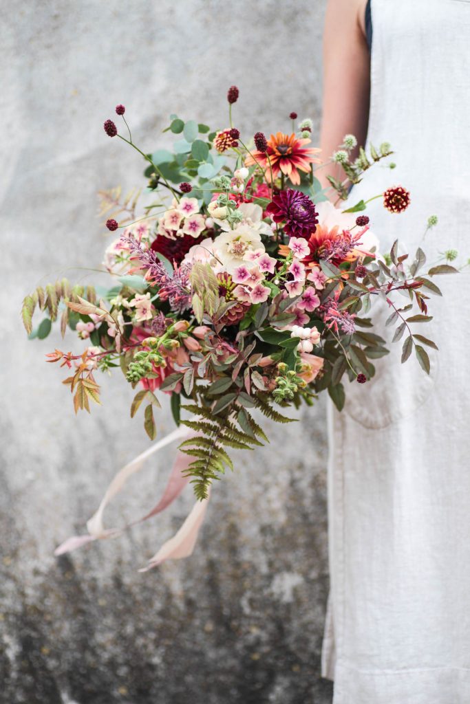
Together with my partner Ash we have been tackling these questions by finding techniques and systems that have allowed us to reduce our acreage and labour but turn over more profit. Over the years we have slowly improved – our site layout, tools and equipment, ways of selling, what we grow, our branding, how much we charge, who does what – to make the business as efficient, profitable and sustainable as possible. It is a work in progress and there is still much to do and learn but I like the challenge and the never ending process of learning which flower farming brings.
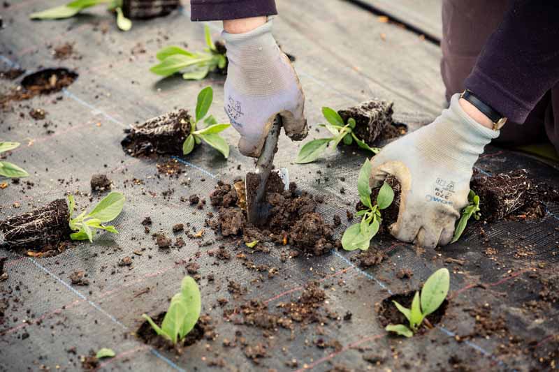
There are many courses out there now on growing cut flowers for business and pleasure with the majority being just for a day. These are worthwhile but can only work as an introduction to the subject, to get people thinking along the right lines. Many of the people that have attended my ‘Flower farming for Beginners’ course over the past five years have been glad to know about pricing and finding the right customers but they need more detailed information on what I call the ‘nuts and bolts’ of growing.
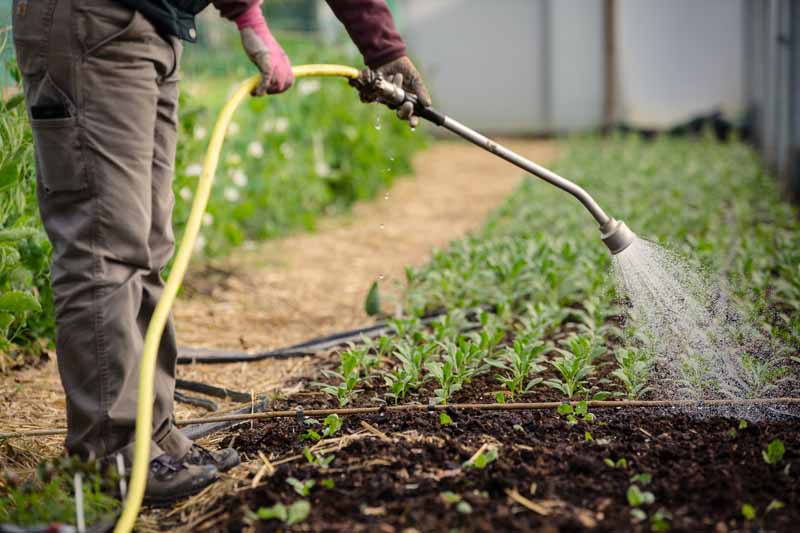
My feeling is that if you are planning to make a career out of floriculture, a series on growing flowers for business would be even better, where you can keep checking in, reinforcing what you are learning in real time. I want to offer a course that runs through the season so that people can learn as they grow.
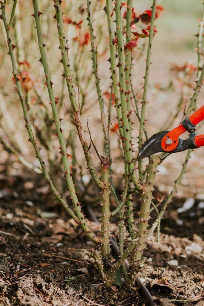
So this year I am offering ‘Flower Farming through the Seasons’ a series of three timely workshops that will take you step by step through a growing season. This will be a real time experience that is completely practical and business orientated, it is aimed at people who are new to Flower Farming or perhaps have done a season and have even more questions than when they started.
For more information about the course and to book online just visit our shop. If you are interested in staying with us the night before we have two rooms available in our farmhouse on a bed and breakfast basis, please get in touch for more details.


